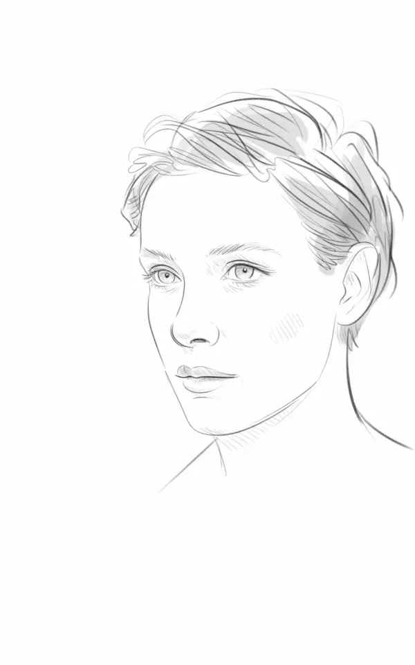
Drawing a face profile for beginners often feels like a guessing game. You sketch the outline, shade around the eye, and hope the result looks human. But the truth is, most beginners make the same few mistakes that stop their portraits from feeling natural. In this step by step pencil sketch guide, I will walk you through the common pitfalls and show you how to avoid them. By the end, you will be able to draw a minimalist profile portrait with delicate line work and soft shading, just like the grayscale sketch you see here.
Starting With the Wrong Head Shape (And How to Fix It)
The most frequent mistake I see is drawing the skull too round or too flat. A face profile is not a perfect circle or a simple oval. The cranium has a subtle curve at the top, a slight flattening at the back, and a gentle slope toward the forehead. Beginners often skip this and jump straight to the nose and chin.
To avoid this, begin with a faint vertical line for the center of the face, then add a horizontal line for the eye level. Draw a soft egg shape that tilts slightly forward. The widest part is around the temple, not the middle. Keep your lines light, because you will adjust them later. This simple foundation will save you from a lopsided profile later on.
Common Mistakes With the Eye and Eyebrow Placement
In a profile view, the eye is not a full almond shape. It is a subtle triangle with a soft curve at the lid. Many beginners draw the eye too large or place it too far forward. In the reference sketch, the eye has gentle shading around it, not a heavy outline. The soft shadow underneath the brow bone gives depth without harsh lines.
- Mistake: Drawing the eye as a complete circle with a dark rim. Fix: Use a light pencil (2H or HB) to sketch a simple wedge shape. Add a tiny curve for the iris under the top lid.
- Mistake: Placing the eye too close to the nose bridge. Fix: The eye sits about one eye-length back from the bridge. Measure with your pencil if needed.
- Mistake: Forgetting the eyebrow arch. Fix: The brow starts above the inner corner of the eye and arcs gently outward. Do not make it a straight line.
Take your time with this area. The eye is the focal point of most portraits, and even a small adjustment can make the expression feel more natural.
How to Handle the Nose and Lips Without Overworking Them
Another common struggle is making the nose look like a sharp hook or the lips too detailed. In minimalist portrait drawing, less is more. The nose in your sketch should be a continuous curve from the bridge to the tip, then a soft line for the nostril. Beginners often draw the nostril as a dark oval, which looks like a hole. Instead, use a light crescent shape that follows the curve of the nose.
For the lips, many people draw a full upper and lower lip with a defined line. In profile, the upper lip often slightly overhangs the lower lip. The trick is to draw the shape of the lips using only two or three gentle curves. Do not outline the entire mouth. Let the shadow between the lips and the subtle curve of the chin do the work. If you look at the grayscale portrait in the reference, the lips are barely there, but you still see their shape because of the light shading around them.
Shading the Jaw and Chin Without Making It Muddy
The jawline in a profile can look too heavy if you shade it with a dark line. Beginners often press too hard, creating a harsh edge that makes the face feel cut out. Instead, think of the jaw as a plane that catches light. In the reference sketch, the shading is soft and gradual, especially around the chin and under the ear.
Use a tissue or your finger to blend the graphite along the jaw. Start from the ear area and move toward the chin. Keep the darkest part near the back of the jaw and let it fade as you reach the front. This creates a natural curve. If you want a more defined chin, add a tiny shadow under the lower lip, not a line around the whole jaw.
Drawing Short Styled Hair: Strands vs. Block Shapes
The hairstyle in the reference is short and styled, with individual strands visible. Many beginners either draw hair as a solid black blob or try to draw every single hair. Both approaches can ruin a minimalist portrait. The key is to find a middle ground where you suggest texture without overdoing it.
Start by blocking out the general shape of the hair around the skull. Use light, short strokes that follow the direction of the hair growth. For short hair, the strokes should radiate from the crown of the head. Do not fill the entire shape with graphite. Leave white space between groups of strokes to show the paper. This gives the hair a natural, airy feel. Add a few darker strands near the forehead and the back of the neck to create contrast.
Balancing the Background and the Face
A common oversight is ignoring the negative space around the profile. In the reference image, the background is completely blank, which forces the viewer to focus on the delicate line work. Beginners sometimes try to add a busy background or heavy shadows behind the face, which distracts from the portrait itself.
For a minimalist approach, leave the background white. If you want to add depth, use very light hatching around the back of the head or the shoulder, but keep it subtle. The face should be the only area with defined shading. This simplicity makes the portrait look clean and professional, even if you are just starting out.
Putting It All Together: A Step by Step Checklist
Now that you know the common mistakes, here is a quick summary you can follow for your next pencil sketch. Keep this list handy while you draw.
- Start with a light egg shape for the head, tilted forward.
- Mark the eye level with a horizontal line, then place the eye one eye-length back from the nose bridge.
- Draw the nose with a continuous curve and a light crescent nostril.
- Sketch the lips using two soft curves, no outline.
- Shade the jaw with gradual blending from the ear toward the chin.
- Block the hair shape, then add directional strokes for texture.
- Leave the background blank or use very light shading only behind the head.
If you follow these steps, you will avoid the common pitfalls that make beginner profiles look stiff or unnatural. The key (even though I promised not to say that word) is really about keeping your hand light and your lines intentional. A calm, patient approach always gives better results than rushing.
Try drawing the same profile a few times. Each attempt will teach you something new about proportion and shading. And if you got value from this guide, save it for later it makes a handy reference when you are working on your own portrait sketches.
Leave a Comment