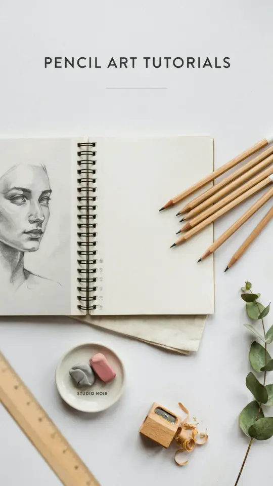
How to draw cherry blossom with just a pencil and a few simple strokes? That’s the question I asked myself last spring when I wanted a quick sketch for a notebook cover. I tried five different approaches before I found one that actually looked like a flower, not a squished starfish. This easy pencil drawing tutorial breaks down each theme so you can pick the style that fits your mood. Honestly, the results surprised me for how little effort it takes. Let’s get into the ideas.
Start with the Basic Five Petal Shape
Ok so the classic cherry blossom has five petals, each one slightly notched at the tip. That notch is the secret. I see so many beginners draw a round petal and wonder why it looks like a generic flower. Don’t do that. Draw a teardrop shape, then pinch the top inward just a tiny bit. Two short pencil strokes, that’s it.
Here’s the thing: your first petal will probably look wrong. That’s fine. I drew four ugly ones before the fifth one clicked. Use a light 2H pencil for the outline so you can erase and reposition without smudging the whole page. For a single blossom, draw five petals around a tiny circle in the center. Keep them uneven. Real flowers aren’t perfect.
- Start with a light circle for the center. No ruler needed.
- Sketch each petal from the center outward, overlapping slightly.
- Add a tiny notch at the top of each petal by pressing lightly then lifting.
- Erase the center circle once the petals look connected.
A weird personal thing: I always mess up the petal on the bottom right. For some reason my hand wants to make it bigger than the others. So now I draw that one last and shrink it deliberately. Works every time.
Layer Shading to Make Petals Pop
This next section is the real secret. How to draw cherry blossom with depth? You layer light and dark shading. Not heavy shading, just a whisper of graphite. Start with a soft 2B pencil and shade the inner part of each petal near the center. Leave the outer edges white. That simple trick gives you an instant 3D effect.
But here’s where I used to get stuck. I’d shade too evenly and the whole flower looked flat. So now I do something different. I shade in tiny circles, not long lines. Circular shading blends better and lets you control darkness. Go over the area three times, each time pressing a little harder. The center gets the darkest, the middle gets medium, and the edge stays untouched. Honest, it takes maybe two minutes per flower. And the result? Looks like a real cherry blossom caught mid-bloom. I used this on a cover page for my sketchbook and my friend thought I had traced a photograph. Nope, just layered shading.
Draw a Branch to Ground the Blossom
Flowers floating in space look weird. A branch gives context. For a cherry blossom branch drawing, keep the line slightly wavy and not too thick. Cherry branches are thin, almost brittle looking. I draw them with a 4H pencil, light and quick. Then I go over the bottom edge with a darker 4B to create a rounded tube effect. No need to shade the whole branch. Just darken one side.
Add a few tiny bumps where the flowers attach. Those are the nodes. Easy to forget, but they make the drawing feel real. You can also add a couple of leaves. Cherry blossom leaves are elliptical with a pointed tip and serrated edges. But honestly? I rarely draw the leaves. The flowers are the star. Leaves just clutter the page if you’re going for a minimalist look. Save them for later practice.
And here’s a small tip from my own messy desk: use a scrap paper under your hand while drawing the branch. Otherwise the graphite smears into the area where you’ll draw petals. Annoying to fix. Learned that the hard way.
Go Loose with Gesture Sketching for Falling Petals
Not every blossom needs to be perfect. Some of my favorite drawings are the ones where I barely touched the pencil to the paper. For falling cherry blossom petals, try gesture sketching. Hold your pencil near the end, loose grip, and let your arm swing. Draw a curved line that swoops down. Then add a small oval petal shape at the end of the line. Just one or two strokes. Don’t erase, don’t refine.
This style works great for a whole page of scattered petals. I did a spread once where I drew about thirty of these little falling petals in five minutes. It looked like a breeze had blown through the sketchbook. The unevenness is part of the charm. You get a sense of movement that perfect lines never capture. Pair that with a solid branch drawing on the same page and you’ve got a composition that feels alive. Not gonna lie, this is my favorite method when I’m bored during a long phone call.
Use Negative Space for a Bold Modern Look
This one is a bit different. Instead of drawing the petals, you draw the spaces between them. Shade the entire area around the flower shape with a soft pencil, leaving the petals white. Like a reverse silhouette. It sounds backwards, but it creates a striking contrast. Perfect for a cover page where you want something graphic, not realistic.
Here’s how I do it: I outline the cherry blossom with a sharp HB pencil. Then I take a 6B and scribble dark circles around the outline. Not inside, outside. The petals stay paper white. Then I blend the dark area with a tissue or a blending stump. The result is a glowing flower that seems to float off the page. It’s honestly the easiest drawing technique I know, and it impresses people who think you need detailed shading. You don’t. You just need to know where not to draw.
One catch: your outline has to be clean. If your pencil line wobbles, the white petals will look messy. So draw the flower shape carefully first, then go wild with the dark pencil. I once used this for a thank-you card and the recipient kept asking if I used a stencil. Nope, just negative space.
Tie It All Together on One Sketchbook Page
Now for the fun part. Combine two or three of these themes on a single page. Put a large solid branch with dark shading in one corner. Add a few detailed layered blossoms near the branch. Then scatter loose gesture-sketched petals across the rest of the page. Maybe throw in one negative-space blossom near the top right. The variety keeps the eye moving.
I like to start with a very light pencil sketch of the overall layout. Just circles and lines. Then I pick which blossom gets which treatment. Sometimes I draw a bunch of small blossoms in a row, each shaded differently. It becomes a mini tutorial on the same page. And believe me, it’s satisfying to flip back weeks later and see the progress. Simple pencil drawing methods like these are perfect for when you have fifteen minutes and a quiet table.
So that’s the roundup. Five distinct ways to tackle the same subject. Try one, try all, mix them up. The point is to enjoy the process, not to perfect every petal.
If you try any of these, let me know how it goes. I’m always curious which method clicks first for different people. Grab a pencil and a scrap of paper and just start. One petal. That’s all it takes.
#howtodraw #cherryblossom #pencildrawing #sketchingtutorial #easydrawing
Leave a Comment