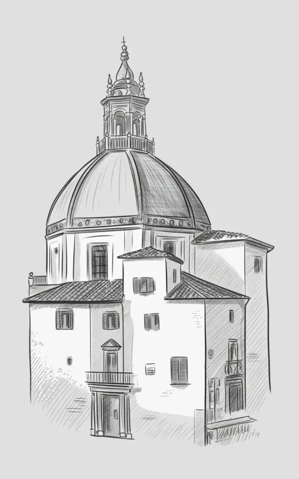
The dome catches you first, doesn’t it? That massive rounded form anchors the whole composition, and then your eye slips down to the tiny windows with their shutters, and you realize you’ve been staring at this Italian church pencil sketch for a full minute without blinking. I get it. I’ve studied this drawing a dozen times, and honestly, it keeps teaching me something new about where I go wrong in my own architecture drawing work. So let’s talk about the mistakes this sketch avoids, the ones you’re probably making too, and how to fix them. This is a keeper for your sketchbook ideas, but only if you actually learn from it.
The Biggest Mistake: Rushing the Dome’s Construction
Most people start a dome and just wing the curves. That’s why their drawings look lopsided or flat. This sketch gets the dome right because the artist clearly blocked in the underlying sphere structure first, then added the ribs and shading on top. You can see the logic in the way the light wraps around the curve. The line work follows the form, it doesn’t fight it.
Here’s what I want you to notice: the dome in this italianchurch drawing isn’t a perfect half-circle. It’s slightly elongated, almost like an egg that’s been pressed down. That’s historically accurate for this style of architecture, and it’s also way more interesting to draw. So before you touch your pencil to paper, sketch a few construction ellipses. Map out where the middle is. Find your center line. Then build the dome on top of that logic.
If you’re using this as an artreference for your own work, zoom in on the shading technique around the dome’s base. See how the strokes get denser in the shadowed area? That’s not random scribbling. That’s deliberate layering that follows the circular movement of the form.
Whitewashed Walls Are Not White Paper
The facade in this pencil sketch looks bright, but look closer. It’s not just blank paper left untouched. The artist used subtle hatching and stippling to create texture and tone on the plastered surfaces. The shadows under the roofline, the slight gray along the edges, the darker patches where the building meets the ground. That’s what makes the walls feel sun-baked and dimensional.
I used to leave my white walls completely clean when I started doing architecture drawing. Big mistake. White paper reads as nothing, not as white paint. The trick is comparing your lightest light against your darkest dark. In this sketch, the left wall catches more sunlight, so it stays lighter. The right side, with the tower? Notice how it steps back in tone and the windows feel deeper, almost like they’re holding their own little shadows inside the frames.
Try this in your next sketchbook session: keep a small scrap of paper under your drawing and test your shading value against it as you work. You need your white whites for highlights, so protect them. Don’t shade the entire facade. Leave patches of pure paper where the sun would actually hit hardest. Then let the shading in the surrounding areas create the illusion of whitewashed plaster by contrast.
That Bell Tower Deserves Better Than Symmetry
Here is something I tell every artist who asks about this piece: perfect symmetry will kill your drawing dead. The bell tower in this sketch is architectural, sure, but the shading and perspective make it feel alive. The balcony level is drawn with enough detail that you can imagine standing up there, looking out over the piazza. But the artist didn’t mirror each side exactly. They let the drawing breathe.
Architecture is symmetric, yes, but drawing it with absolute mathematical precision makes it look like a blueprint. And nobody frames a blueprint for their wall. Instead, push the perspective a little. In this sketch, the tower isn’t photographed straight-on; it’s drawn at a slight angle, so the right side of the tower shows a hint of the curve of the building behind it. That tiny slip of perspective is what makes you feel like you’re actually standing in front of this building in Italy.
Also, notice the little details packed into the tower: the arches, the balustrade, the finials on top. I recommend you draw with a fine-tipped pencil (mechanical, if you have one) when you’re working on architectural details like this. A standard HB will just mush together and you’ll lose the crispness that makes these elements read clearly in the overall composition.
Windows and Shutters Are Not an Afterthought
Look at the tiny rectangular windows in this pencil sketch. They’re small, but they carry so much weight. Each one has a sense of depth because the artist treated them as recesses in the wall, not as flat rectangles pasted on the facade. The shutters are indicated with just enough detail to imply their function, but not so much that they distract from the overall structure.
If you’re still unsure about how to handle this in your own artreference, remember one simple rule: cast shadows belong on the wall, not just in the window frame. The top of the shutter gets a hint of shadow, the sill drops a shadow onto the wall below, and the interior of the window opening gets the darkest value of all. That layering creates depth. It’s honestly the cheapest trick in the book, and it always works.
- Start with the window outline, then add the frame thickness.
- Darken the interior opening before you even touch the shutter details.
- Sketch the shutter with two or three quick strokes, don’t overthink it.
- Drop a light cast shadow below the window sill to anchor it.
Those four steps will completely change the way your architectural drawings feel. Trust me on this. I learned it after a full year of drawing flat, lifeless windows and wondering why my buildings looked fake.
Shading the Facade Without Losing the Details
There is a real balancing act between shading the whole facade and keeping your architectural details visible. This sketch nails it. The deeper shadows along the roofline and under the cornice are rendered with denser strokes, while the mid-tones use lighter, more open hatching that lets the paper glow through. And the details? They aren’t hidden behind the shading. The artist strategically left areas around the windows and doorways slightly under-shaded so those spots attract your eye.
Think about how lighting matters for this too. The sketch isn’t showing you a flatly-lit building. It’s showing you Italian afternoon sun raking across a whitewashed facade and cast harsh shadows that cut across corners. That is why the tiny windows stand out so much.
The Finials and Decorative Spire: Getting the Top Right
Okay, let’s talk about the decorative spire on top of the dome, because that part of architecture drawing scares a lot of people. The foliage, the little ball-topped finials, the cross at the very peak. It’s all a bit ornate, and it’s easy to freeze up and just scribble. But this sketch handles the ornate elements with real confidence, and here’s the thing: the artist didn’t try to draw every individual leaf. They suggested the form with a few confident marks and let the shading imply the rest.
When you approach a complicated spike or finial structure, squint at your artreference. See the overall shape. Draw that silhouette first, then worry about the divisions and ornaments. And if you’re working from a reference photo of your own, don’t be afraid to slightly simplify details that look too intricate for your skill level. A clean, simple spire reads much better than a messy, overcomplicate one. This is one of those common mistakes that separates a nice drawing from one that looks, well, just a bit off.
Notice too that the top isn’t just one long spire. It’s a series of shorter, stacked elements. The artist emphasized those transitions with tiny shadow lines. Each change in direction is a place for a cast shadow, so embrace that rhythm. When you get the top right, the whole drawing feels grounded.
What This Sketch Means for Your Next Art Session
Keep this italianchurch reference in your sketchbook pile for your next art session. Seriously. Print it out and put it in your reference folder. It gives you plenty to study: the dome, the bell tower, the shutters, the facade shading. You could spend two hours just on the shading alone. It’s such a forgiving reference too, you won’t feel stressed about capturing every tiny brick, because there aren’t any bricks here. The whitewashed walls simplify the form, which makes it a really good drawing for practicing tone and architectural perspective without drowning in textures.
And if you use Pinterest, save this to your architecture drawing board. I’ve got a whole folder of Italian church pencil sketches, churches with domes and towers, and I go back to them constantly for inspiration. You should do the same. The more you look at how other artists handle perspective and shading, the better your own drawings will get.
So here is where I wave my hand and point you back to your own sketchbook. I want to see you building better domes, shading those window shutters with real confidence, and handling bell towers with the respect they deserve. This Italian church sketch has all the answers if you actually stop and study it. So why not pull out your pencil and try your own hand at it today? You don’t need a plane ticket to Italy. You just need some paper, a few sharp pencils, and a willingness to learn from the artists who got it right before you.
Leave a Comment