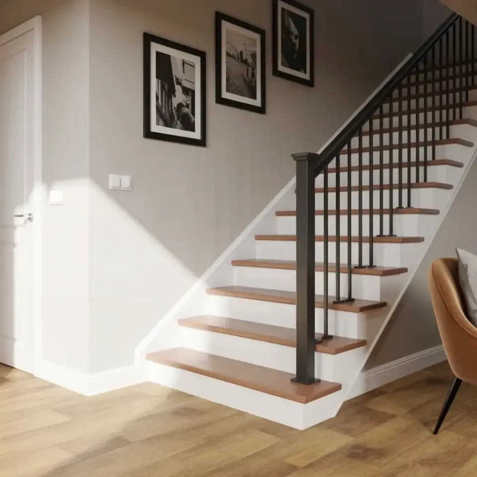
Ok so, I’ll be honest. The look you’re after (modern staircase with black railing and a vertical photo gallery wall) is deceptively simple. Everyone sees that clean Pinterest photo and thinks, “I can do that.” And you can. But I’ve seen so many people botch it with one weird choice after another. The light wood treads look great. The white risers feel fresh. The black metal railing adds that perfect punch of contrast. But then the photo gallery ends up crooked. Or the frames are too big. Or the railing clashes with everything else in the house. Let me walk you through the common mistakes I’ve personally witnessed (and made myself) so you can skip the headaches and land on something that actually feels intentional.
Mistake #1: Choosing the Wrong Black Railing Finish
Look, not all black railings are created equal. You might think “black is black” and grab whatever matte powder-coat option is cheapest. Big mistake. The finish drastically changes the mood. Matte black feels soft and modern. Gloss black screams “look at me I’m shiny” and can read as cheap if the metal is thin. I once helped a friend pick railing for her staircase and she insisted on a hammered texture black. It looked like a cast-iron skillet. It was horrible. For a truly modern staircase with black railing, go for a satin or matte powder coat with a slight micro-texture (not glossy, not rough). Also, test a sample against your wood treads. The light oak in the photo has warm undertones. A blue-black railing will clash. A true neutral black works best.
Mistake #2: Hanging Photos at the Wrong Height on a Staircase Wall
Here’s the thing about vertical photo gallery walls on stairs: the eye travels up at an angle. If you hang your three frames at eye level when standing on the landing, they’ll look way too low from the stairs below. And if you space them evenly from top to bottom, the middle one might land right behind the handrail. I’ve done this. I had to rehang everything twice. The trick is to step back and mark the center of each frame where you actually see it from the bottom step, the middle step, and the top step. Measure the distance from each tread to the center of the photo. And use a level, but not just any level. The bubble level on your phone is fine but hold it against the wall, not the frame. I cannot tell you how many times I’ve seen photos slightly tilted because someone leveled the frame instead of the wall itself.
Mistake #3: Picking the Wrong Wood Tone for the Treads
Light wood treads with white risers look airy, sure. But “light wood” is a minefield. Bleached oak can look anemic. Honey oak goes straight 1990s. I personally love a natural white oak with a clear matte sealer. That warm blond tone (like in the image) feels modern without being sterile. But here’s the mistake I see homeowners make: they match the stair treads to their floorboards exactly. That can work if your floor is the same light oak running horizontally, but if your floor is a different tone, you get visual chaos. Also, don’t skip the riser paint. White semi-gloss is standard but I prefer a slightly warm off-white (like Benjamin Moore Swiss Coffee) so it doesn’t look like a hospital. And for the love of all things clean, paint the risers after the treads are installed. You do not want paint drips on your new light oak.
Mistake #4: Overcrowding the Wall with Too Many Frames or Bad Art
Three black-framed black and white photos. That’s it. I know you have a thousand family photos from your vacation in Maui. Resist the urge. A vertical row works because it creates a rhythm that mirrors the staircase itself. More than four frames and you lose the minimalist effect. Fewer than two and it looks like an afterthought. And please, choose images with strong contrast, dark blacks, bright whites, maybe a moody landscape or a portrait with a clean background. Do not use sepia or color here unless your entire home is very warm. The black frames need to talk to the black railing. If you use gold frames, it becomes a completely different vibe. Also, matting matters. Use white or off-white mats, not black. Black mats inside black frames just looks like a void. Trust me on this.
Mistake #5: Forgetting About the Wall Color and Baseboards
The photo shows a light gray wall. That gray is doing a lot of heavy lifting. It’s neutral enough to let the staircase pop but has enough depth to separate the white risers from the wall. If you paint the wall white, you lose all definition between riser and wall. If you go dark charcoal, the black railing disappears and the whole thing gets cave-like. I suggest a pale warm gray (like Sherwin Williams Agreeable Gray or a greige). And those baseboards? They’re white. Keep them white. The contrast between the gray wall and white baseboards is subtle but adds crispness. One more hyper-specific detail: that light switch plate next to the stairs? In the photo it’s white. If you have a beige or ivory plate on a gray wall, it will bug you every single day. Swap it out for a bright white plate. It’s a ten-dollar fix that makes a huge difference.
Mistake #6: Neglecting the Flooring Transition and the View Below
Notice in the image there’s a partial brown velvet chair? Yeah, that’s not an accident. The staircase does not exist in a vacuum. The flooring, light oak planks running horizontally, creates a sense of width. But if you have dark flooring meeting those light treads at the bottom, it can look abrupt. Consider a transition strip in a matching wood tone. And look at what’s visible from the stairs. In the photo, you see a bit of a brown velvet chair. That adds warmth. If your landing opens onto a cluttered bookshelf or a bright yellow wall, your modern staircase will fight that chaos. So take a photo from the middle step looking down. What do you see? If it’s not cohesive, fix it or hide it. I once had a bright red fire extinguisher right at the base of my stairs. I moved it to the garage. Now my photo wall actually works.
Honestly, the biggest lesson here is restraint. Minimal but not cold, that line in the Pinterest description nails it. The modern staircase with black railing and a vertical photo gallery wall only works if every element breathes. The treads are light, the railing is sharp, the photos are intentional. Each piece earns its place. So before you buy anything, step back. Look at your space. Think about the light. And for crying out loud, use a level.
If you’re planning to update your staircase, save this article for later. Pin it, bookmark it, whatever. And when you finish, come back and tell me how it turned out. I’d love to see photos (but maybe not in a vertical row on your stair wall, kidding, please do that).
Leave a Comment