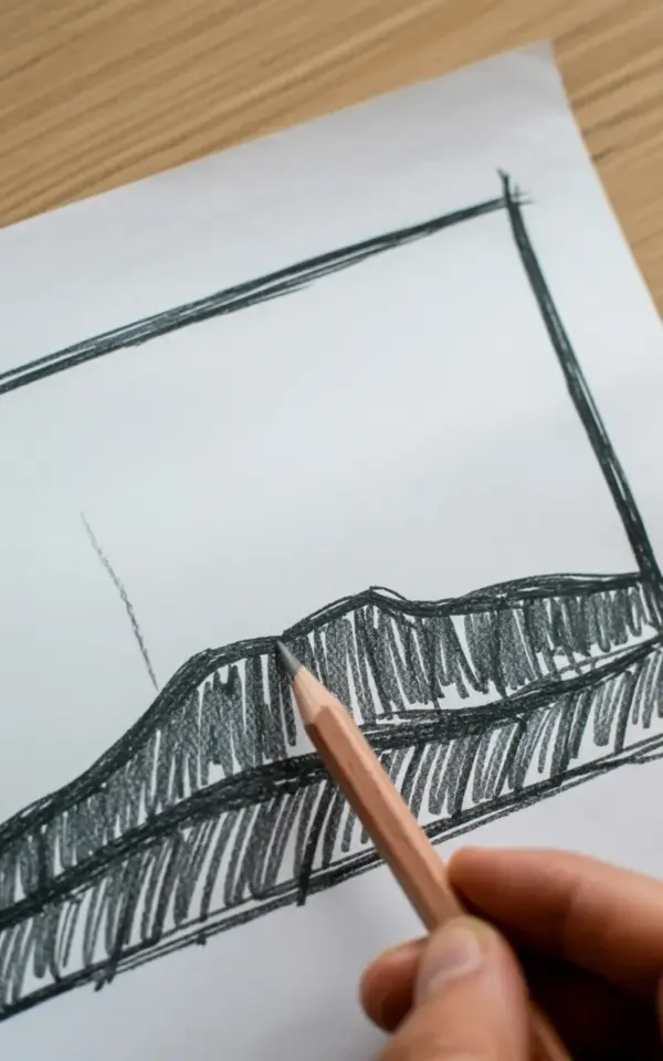
There is a particular kind of quiet satisfaction in looking down at a piece of paper and seeing a mountain range appear from nothing but a cheap wooden pencil. The photo of this particular sketch, with its dark, hatched peaks and the simple black border, captures that exact feeling. It proves a point that many overcomplicate: you do not need fancy supplies or a studio to make something expressive. This pencil sketch mountain landscape is the perfect budget drawing idea, and it all comes down to understanding a few common mistakes before you even put graphite to paper.
Look, most beginner landscape drawings fail for the same reasons. They do not fail because of a lack of talent or expensive tools. They fail because of a few specific, easily avoidable errors that can be fixed immediately once you know what to look for. I have taught this exact type of drawing for years, and I have seen the same problems crop up again and again. Here is a guide to the most frequent blunders and how to sidestep them, so your next sketch actually looks like the moody, expressive image you have in your head.
Mistake Number One: Gripping Your Pencil Like a Screwdriver
The most common flaw in beginner sketching is a white-knuckle death grip on the pencil, held upright like you are trying to write a letter. That posture is fine for signing a check, but it is terrible for shading large areas like a mountain face. It creates tight, nervous lines that look scratchy and stiff, not bold and expressive.
You want to hold the pencil further back, almost like you are holding a stick of charcoal. Let it rest loosely in your fingers, with the side of the lead touching the paper rather than the sharp point. This allows your entire arm to move, not just your wrist. Try it for a minute, just scribble some loose back-and-forth motions on scrap paper. You will immediately notice that the lines become softer, broader, and much easier to control.
The wooden pencil in the photo of this sketch is held at a low, relaxed angle near the bottom of the frame. It is not a dramatic, upright writing position. That relaxed angle is exactly why the hatching in the drawing looks so natural and fluid. If you feel your hand cramping after five minutes of drawing, you are holding the tool too tightly.
Fighting the Paper Grain Will Ruin Your Mountains
Another mistake I see constantly is the desire to make the paper completely smooth and the graphite perfectly flat. People use a lot of pressure to try and eliminate the texture of the paper, which results in a dark, shiny, greasy-looking mess that is almost impossible to erase. You cannot force the paper to be smooth; it is not a canvas.
The beauty of a sketch like the one in the photo is that it embraces the tooth of the paper. The whites of the paper show through the hatching lines, creating that sense of light and atmosphere that makes a drawing feel alive. Look at the image; the dark gray peaks are built with visible, loose lines, not a solid black fill. That is a conscious choice to let the paper do some of the work.
To get this right, you need to layer. Build up the darkness slowly, using light pressure and multiple passes of hatching. Start with a light gray, then cross-hatch over that, and then add another layer on the darkest shadow areas only. Let the paper grain bounce the light around. It is a much more forgiving method, and it looks far more professional than a solid block of graphite.
Applying the Same Line Weight to Everything
This is the one that makes drawings look flat and boring. If every line you draw is the same darkness and thickness, your mountain will look like a cutout pasted onto the page, rather than a massive, distant landmass. There is no depth if there is no variation in contrast.
In the reference sketch, some areas are a light, delicate gray, while the lower peaks are a deep, dark charcoal. That contrast is what creates the illusion of form and distance. It tells your eye where the light is coming from and which peaks are receding into the fog.
Here is a simple exercise: before you draw the final lines on your good paper, do a value scale in the corner of your sketchbook. Just a little rectangle, maybe two inches by one inch. Fill it with ten small boxes and try to fill each box with a progressively darker tone. This warms up your hand and forces your brain to think in terms of a range of values. Once you have that range in your head, you will naturally start using lighter strokes for the distant ridges and heavier, denser hatching for the foreground peaks.
Forgetting the Border and Composition Rules
It is easy to just start drawing in the center of the page, but this usually leads to the subject feeling lost or unbalanced. A common mistake is placing the horizon line perfectly through the middle of the paper, splitting the composition into two boring, equal halves. It is static and unnatural to the eye.
Have you noticed that the sketch in the photo has a simple black rectangular border around it? That border is not just decoration; it acts as a frame that contains the energy of the loose sketch. It gives the drawing a defined edge and forces the composition to work within a specific format. It also makes the drawing look finished, even if it took you only fifteen minutes.
When you start, take a ruler or just your eye and draw a faint border on your paper first. Then, think about your composition. Try placing the peak of your mountain off-center, maybe about a third of the way from the top or side of your frame. This is a classic rule of thumb that immediately makes your sketch more dynamic. It gives the eye a path to travel and creates a natural tension that a centered drawing lacks.
Using Erasers as a Crutch for Every Happy Accident
Many beginners erase constantly, treating every wayward line as a catastrophic failure. They end up with a smudged, fuzzy mess and a paper surface that is roughed up and damaged. The eraser is a tool, sure, but it is not the only tool for fixing mistakes. Sometimes, the best thing to do is just draw the correct line right next to the wrong one.
Those extra lines can actually add to the “sketchy” charm, which you can see clearly in the reference photo. The drawing has a loose, expressive quality with lines that overlap and cross over each other. It does not look sterile or over-polished. It looks like a human made it, thinking and feeling their way through the subject.
So, my advice is to limit your eraser usage for the first pass. If a line is wrong, just leave it and draw a better line over it. Nine times out of ten, the correct line will hold the viewer’s attention, and the ghost line underneath will just add texture and depth. You can always go back with a kneaded eraser later to lift out any highlights or clean up the area if it gets too chaotic. Your paper will thank you for it.
The “Too Big, Too Fast” Approach to Shading
The final mistake is trying to shade a huge area all at once. People see a big dark mountain and immediately try to shade the entire shape in one go with a single side-to-side motion. This creates a uniform, banded look that often has awkward streaks in it.
Instead, you should break the mountain down into smaller planes and facets. Imagine the mountain is made of a series of interconnected, angular panels, like a poorly wrapped gift. Shade each facet separately, changing the direction of your hatching for each one. In the photo, you can see this technique in action; the hatching lines change direction subtly across the different faces of the peaks.
This does two things. It adds a wonderful three-dimensional quality to the rock, and it confines the shading to manageable, smaller chunks. It is much easier to control the value and contrast when you are working on a two-inch wide section rather than the entire side of a mountain. It takes a little more time, but the result is a much more convincing texture.
Final Thoughts on Your Sketch Practice Session
Getting a good landscape sketch is rarely about talent; it is mostly about relaxing your hand and letting the graphite do the work. When you finally finish your version, do not immediately flip the page or erase your mistakes. Step back, look at the border, and admire the range of dark gray tones you created with just a single pencil and a piece of paper.
If you have any paper lying around, just grab it. Spend fifteen minutes sketching a mountain, and focus only on loosening that grip and using those varied hatching lines. The goal is not perfection, it is just to get some honest sketchpractice and enjoy the process. I would love to hear how it turns out, so feel free to share your progress in the comments below!
Leave a Comment