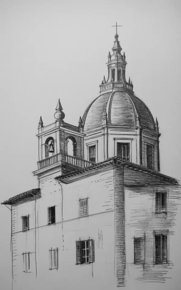
Last month I finally sat down to draw the pencil sketch of a historic Italian church that had been sitting in my reference folder for ages. It’s a white-washed building with a huge rounded dome, a skinny bell tower on the side, and a whole lot of little details that looked like a nightmare until I actually started. This one sketch taught me more about architectural drawing than three weeks of formal practice. So I want to walk you through what worked, what almost made me give up, and how you can use the same approach for your own sketchbook ideas.
Why a white-washed church with a dome is a perfect drawing challenge
I’ve tried sketching modern buildings before. Glass towers, concrete boxes. They look simple, but the lines are boring and any mistake stands out like a sore thumb. This church, though, has layers. The bell tower is not centered, the dome sits slightly to one side, and the small rectangular windows are scattered across a facade that’s clearly been patched and painted over the centuries. That asymmetry is what makes it interesting.
Honestly, a building with this much detail gives you permission to be messy. You can’t get every shutter right, and nobody expects you to. The sketch in the photo has careful attention to shading on the finials and shutters, but it’s not a photograph. It’s a human response to a structure. And that’s the whole point.
How I shaded the dome so it doesn’t look like a flat circle
The central dome is the first thing your eye lands on. It’s large, rounded, and topped with a decorative spire that has a bunch of ornate finials. When I started, I sketched a perfect half-circle and shaded the left side with uniform strokes. It looked like a plastic bowl. Not good.
What actually worked was leaving the highlight near the top-left and building up the shadow in layered hatching that follows the curve. I used a soft 2B pencil, then a harder HB to smooth the transition. The dome isn’t a solid shape; it’s a series of attached curves, and the shading has to wrap around those. I remember gripping the pencil so hard that my index finger had a dent for an hour afterward. Dumb, but it shows how much focus this part takes.
The bell tower and its balcony level: a lesson in vertical lines
Bell towers are brutal at first because they’re so tall and narrow. One wrong angle and the whole tower looks like it’s about to fall over. This church’s
Leave a Comment