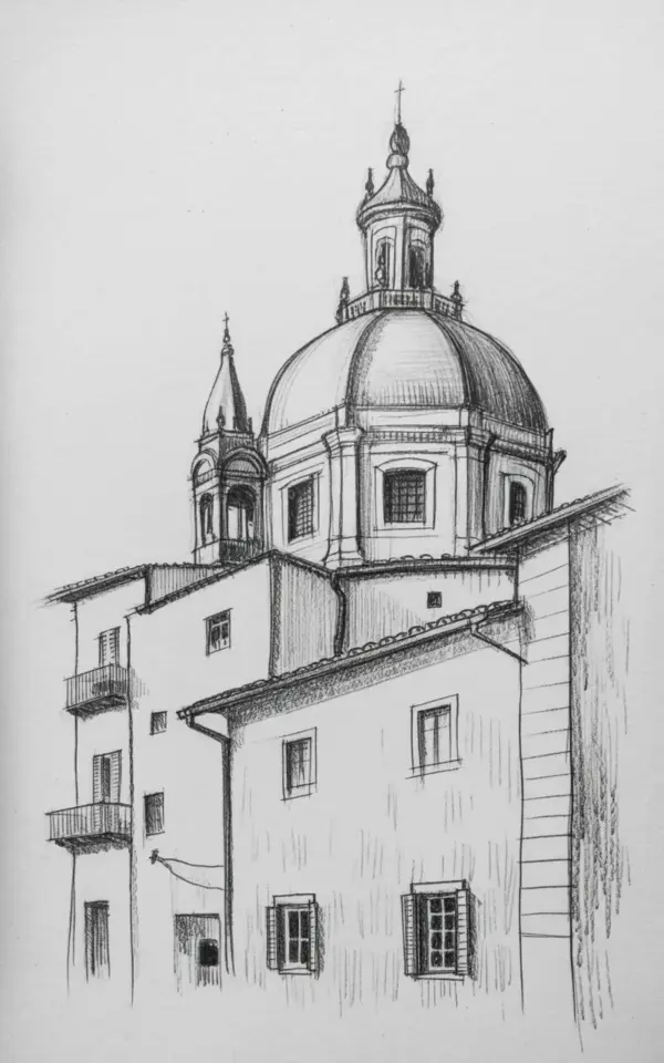
There is something about a pencil sketch of an Italian church that just stops me mid-scroll. The dome, the bell tower, those tiny shuttered windows tucked into white-washed walls. I have a particular drawing saved on my phone of a historic Italian church with a prominent dome and bell tower, and honestly, I keep zooming in on the spire ornaments. They are such tiny details but they make or break the whole thing. If you have tried sketching this kind of architecture yourself, you probably already know it is not as simple as it looks. So I want to walk through the common mistakes I made (and still make) when drawing Italian churches, and how you can dodge them on your next sketch.
Mistake #1: Getting the Dome’s Proportions Wrong
The biggest trap is making the central dome too squat or too tall. In the pencil sketch from my reference photo, that dome is large and rounded, not a perfect hemisphere but close to it, with a graceful curve that says “I belong in an Italian piazza.” If you draw it too flat, the whole church looks like a toad. Too tall, and it becomes a rocket silo.
Here is the trick I learned the hard way: block in the dome’s width first. Measure against the bell tower’s height with your pencil held at arm’s length. The dome should be roughly the same width as the bell tower is tall, sometimes a little wider. And do not guess the curve, lightly sketch a full circle (in perspective) and then erase the bottom half. That gives you that satisfying rounded top.
By the way, I once spent an entire afternoon trying to get that spire right and ended up with something that looked more like a medieval spaceship. So I feel your pain.
Mistake #2: Overworking the Shading on White-Washed Walls
White-washed walls look simple, but they are the easiest place to ruin a sketch. Many people shade them too dark, thinking they need to “add contrast.” But the reference sketch shows a lightness that feels like a quiet Italian afternoon, not a moonless night. The walls are white, yes, but they have subtle shadow gradients where the dome overhangs or where the wall meets the bell tower.
Here is a realistic tip: use a soft pencil (2B or HB) and apply the lightest touch. Build up the shading in layers. The mistake is pressing hard early, then you cannot erase without smudging. Instead, think of the wall as a series of pale rectangles with just a hint of shadow on the right side (or left, depending on your light source). And for goodness’ sake, leave some areas completely untouched, let the paper be the white.
- Do this: start with a very light hatching on only one side of the building.
- Not this: covering the entire wall with graphite and then trying to lift it with an eraser. That never looks clean.
- Odd personal aside: I actually keep a scrap piece of paper under my palm so I do not smudge the white areas. My high school art teacher would be proud.
Mistake #3: Forgetting the Bell Tower’s Balcony Detail
In that sketch, the bell tower has a balcony level with little ornamental railings or a visible ledge. I have seen so many drawings where the bell tower is just a tall rectangle with a square top, no balcony, no sense of depth. It looks like a chimney. But the balcony is what gives the tower its character, it is the spot where you imagine standing to look out over the town.
To avoid this mistake, look at the reference: there is a distinct change in line weight where the balcony projects outward. Draw a thin horizontal line first, then add a row of tiny verticals for the railing posts. Do not try to draw every single baluster. Just indicate them with dashes. The viewer’s brain will fill in the rest. And add a soft shadow underneath the balcony to make it pop off the wall.
Mistake #4: Rushing the Windows and Shutters
Little rectangular windows with detailed shutters are the quickest thing to skip or overcomplicate. The sketch shows several small windows, and each one has a distinct shape with shutters that look like they could swing open. The common mistake? Making them all the same size, evenly spaced, like a prison block. Italian church windows are not perfectly symmetrical machines, they often have slight variations in width because of structural quirks.
So draw them one at a time. Start with the window opening as a small rectangle. Then add the shutter outlines as two narrow rectangles flanking it. The detail is in the slats, so draw a few fine horizontal lines inside each shutter area. But do not go cross-eyed perfecting them. A little wobble looks handmade and charming.
And here is a weird thing I noticed: the shutters in the reference are darker than the walls, but not black. They are a mid-tone hatch. If you make them too dark, they leap forward and ruin the depth. Keep them a step below the wall’s shadow tone.
Mistake #5: Ignoring Perspective and Spire Ornaments
Perspective is the villain of every architectural sketch, especially when you have a prominent dome and bell tower next to each other. The dome is large and rounded, yes, but it also sits on a drum that has its own vanishing lines. A classic mistake: drawing the dome’s base as a straight horizontal line when it actually curves away in space. Similarly, the bell tower’s vertical edges should angle slightly inward toward a vanishing point if you are looking up at the church.
For the spire ornaments (those finials and decorative elements on top), do not sketch them as abstract blobs. Look at the reference: the spire is topped with a finial that has a little ball and a cross or a small spirelet. The common error is to either add too many decorative squiggles (making it look like a fancy birthday candle) or to leave it bare (making it look utilitarian). Find a middle ground: one distinct shape at the tip, maybe a small circle and a triangle, then a few lines indicating the metalwork below.
I actually trace the perspective lines in my head by extending my pencil along the edges until they meet. That sounds nerdy, but it saves me from drawing a leaning tower of Pisa when I meant a straight campanile.
Mistake #6: Not Adding Enough “Italian Town” Vibe
A sketch of a church dome and bell tower can be technically perfect but feel empty if you do not include the environment. The original description mentions “a quiet afternoon in a small Italian town.” How do you convey that in pencil? The answer is foreground. Add a few simple rooftops, a suggestion of a cobbled street, maybe a lone cypress tree or a distant hill. I am not saying draw a whole piazza, but a couple of horizontal lines at the bottom to hint at other buildings can instantly ground the church in its context.
The mistake is leaving the bottom of the page blank or just putting a ground line. No, put some low roofs with simple triangular shapes and a few windows. Use lighter pencil pressure so they do not compete with the main subject. And if you really want that “quiet afternoon” feeling, leave some open white space around the church, do not fill every corner. Let the sketch breathe.
Also, a personal pet peeve: people sometimes draw Italian churches with super sharp, dark outlines like a coloring book. But real Italian architecture has soft edges from weathering and sunlight. Use a softer pencil and blend the outer edges into the paper. It makes a huge difference.
Anyway, these are the mistakes I see most often, and honestly, I have committed every single one of them at least twice. The good news is that fixing them is mostly about slowing down and really looking at your reference. That dome? It wants to be rounded and full. Those shutters? They want a little personality. And the bell tower balcony? It needs its moment in the sun (or shade).
If you have a pencil sketch of an Italian church sitting half-finished in a sketchbook, pull it out. Look at where you might have made one of these errors. A few careful eraser strokes and some light re-shading can completely transform it. And hey, if you ever want inspiration, go search for “Italian architecture pencil sketch” and lose an hour scrolling. I sure did. Save this article if you love travel-inspired art as much as I do, and next time you draw, give that dome the respect it deserves.
#ItalianArchitecture #PencilSketch #ChurchDrawing #ItalyTravel #SketchArt
Leave a Comment