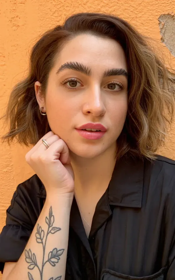
Portrait drawing tips are everywhere online, but the best advice I ever got was to use a real selfie reference with natural lighting and personal details. The photo I’m working from today is a close-up against a warm orange wall, with shoulder-length wavy brown hair, defined eyebrows, a touch of pink lipstick, and a delicate floral vine tattoo winding around the left wrist. The hand rests near the chin, showcasing a simple silver ring. This kind of reference forces you to handle contrast, skin tones, and small layered details all at once. Below are seven distinct ideas I pulled from this single image to help you practice sketching faces with more confidence.
Warm Orange Wall as a Backdrop for Hair Contrast
The textured orange wall in this selfie does more than add color. It sets up a strong value contrast against the brown hair. Brown hair can easily look flat on paper, but when you place it next to a warm, mid-tone background, the edges pop. Try blocking in the background first with a light layer of orange-toned pencil or shading. Then switch to a 2B or 4B for the hair. Keep your strokes loose in the wavy sections and press harder near the part line. The wall also casts a subtle warm bounce light on the skin, especially along the jawline. Notice that in the photo the skin picks up a slight orange glow. You can replicate this by lightly blending a bit of peach or ochre into the shadow side of the face.
Defined Brows and Natural Pink Lipstick
The eyebrows in this reference are clearly defined but not overdone, which is a great challenge for portrait drawing. Each hair has a direction and thickness. When sketching, use short, angled strokes with a sharp HB pencil. Don’t outline the eyebrow shape first, that makes it look drawn on. Instead, build the form with tiny lines that follow the natural arch, then soften the edges with a blending stump. For the pink lipstick, pay attention to the light hitting the lower lip. Lips are three-dimensional, so use a softer pencil like 2B for the darker creases and a 4H for the lighter pink highlights. The natural makeup look means the skin tone is even, so avoid harsh contour lines. Instead, rely on subtle shading around the nose and under the chin to suggest depth.
Hand Near Chin: Practicing Facial Proportions
A hand placed near the chin changes how you measure the face. In this selfie, the subject’s left hand is slightly curled, with the index finger near the chin and the silver ring catching the light. This pose pushes you to check the distance from the chin to the jawline, and then compare that to the length of the hand. A common mistake is making the hand too small or too large relative to the face. I suggest sketching the hand as a simple shape first, then adding the ring and knuckles later. The silver ring is a perfect detail to practice metallic reflection. Use a kneaded eraser to lift out a bright highlight on the top curve. The shadow underneath the ring should be dark and tight, done with a 6B pencil lightly.
Delicate Floral Vine Tattoo on the Wrist
The floral vine tattoo on the left wrist is small but packed with fine lines. This is where the SketchingFaces skill meets detailed linework. Don’t rush the tattoo. I recommend drawing the wrist and hand completely first, then coming back to add the vine. Use a sharp 2H pencil for the thin stems and a 4B for the slightly thicker leaves. Follow the curve of the wrist bone. The tattoo wraps around, so the lines should get lighter where the wrist turns away from the light. This kind of detail makes a portrait feel personal and real. If you’re working from a grayscale print, imagine the tattoo in a slightly darker value than the surrounding skin. For this photo, the tattoo is a soft charcoal tone against fair skin, so a medium light touch works best.
Shoulder-Length Wavy Brown Hair: Texture and Movement
Wavy hair can be intimidating because it has no predictable pattern. In this reference, the brown hair falls just past the shoulders with gentle waves that catch light at different points. I like to approach this by first blocking in the overall shape of the hair mass with a 6B pencil, keeping the strokes vertical and following the fall of the strands. Then go back with a kneaded eraser to pull out highlights where the light hits the top of each wave. The black collared shirt underneath provides a dark contrast, so don’t blend the hair into the shirt. Leave a thin line of light between the hair and the collar to separate the values. For the wavy texture, vary your pencil pressure. Harder for tighter curls, softer for loose waves. Test on scrap paper first.
Leave a Comment