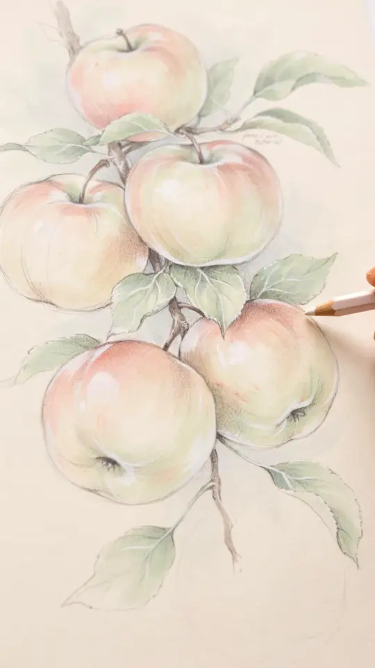
Intro: Why Most Beginners Struggle with Realistic Apple Drawing
I have been teaching watercolor pencil techniques for years, and the most common request I get is for a realistic apple drawing. It seems simple, a round fruit with a stem, but so many beginners end up with a flat, muddy shape that looks more like a cartoon or a bruised potato. The problem is never talent. It is almost always a handful of repeatable mistakes. If you learn to spot and fix those mistakes, you can create a juicy, lifelike apple that looks good enough to bite. This realistic apple drawing tutorial is built around exactly those pitfalls, so you can skip the frustration and go straight to a satisfying result.
Mistake 1: Starting With Wet Paper Instead of Dry Layers
I see this all the time. A beginner takes a watercolor pencil, scribbles a shape with water, and then tries to blend. The paper buckles, the color bleeds outside the lines, and suddenly the apple looks like a watercolor blob with no edges. Watercolor pencil techniques for beginners need to start dry. Layer your base colors on dry paper first. Build up pressure gradually. Only then do you add a damp brush to activate the pigment.
Think of it like building a cake. You need a solid dry base before you add the frosting. Use a light hand for the first layer of color. Keep the pencil strokes following the round curve of the apple. This gives you control over the shape and value. When you are happy with the dry layers, use a small brush with just a little water to gently melt the pencil marks. The results stay crisp and clean.
Mistake 2: Ignoring the Light Source
An apple without a clear light source is a flat shape. I have drawn dozens of apples myself, and the moment I started marking where the light hits, everything changed. Shading and highlights for fruit art are not about guessing. Decide where your light is coming from before you even pick up a pencil. For a classroom or desk setup, a single lamp from the upper left works perfectly.
On your apple, leave a small white area near that light source. That is your highlight. Do not color over it. The rest of the apple needs a gradual transition from light to shadow. The darkest part is on the opposite side, especially near the bottom curve. Use a slightly darker red or even a little purple for that shadow area. Watch the reflection. A real apple has a subtle bounce light on the shadow side. A tiny bit of pale yellow or white pencil can create that glow without making it look dirty.
Mistake 3: Overworking the Blend Until It Looks Muddy
Blending watercolor pencils smoothly is a skill that takes patience, but the biggest killer is rubbing too much. I used to scrub my brush back and forth until the paper started pilling. The result was a grayish brown mess. Stop before the paper is saturated. Use a damp brush, not a wet one. Stroke in the direction of the apple’s curve, and lift the brush cleanly.
Here are a few rules I follow to keep colors pure:
- Use a separate brush for each major color family to avoid cross contamination.
- Blend only one or two sections at a time. Let the paper dry before moving to an adjacent area.
- If you see the color turning muddy, stop and let it dry completely. You can add a fresh dry layer on top later.
- Kee0p your brush almost dry after the first pass. A little water goes a long way with watercolor pencils.
Mistake 4: Using the Wrong Green or Red (Color Choices Matter)
I once watched a student use a bright, almost neon red pencil for an apple. It looked like a candy, not a fruit. Choosing colors for lifelike apple drawing is about observation. Most apples are not pure red. They have yellow, orange, and even green undertones. A common red apple like a Fuji or Gala has a warm base with slight green near the stem.
Grab a few reference photos or look at a real apple. Layer a pale yellow over the whole apple shape first. Then add a warm red (like crimson or vermilion) over the top, leaving the yellow showing near the edges. For the green parts, use a muted olive or sap green, not a bright lime. The stem is a separate challenge. It is usually a brownish green with a tiny shadow underneath where it meets the body. Do not color the stem black. A mix of burnt umber and green works much better.
Mistake 5: Forgetting the Cast Shadow and Stem Details
I have seen beautiful apple drawings that look like they are floating in the air. Adding details to fruit drawings such as a cast shadow and a careful stem turns a good sketch into a realistic one. The cast shadow on the table tells the viewer where the apple rests. It should be darker directly under the apple and fade out as it moves away. Use a cool gray or a dark purple pencil, not black. Black shadows look dead.
The stem also needs attention. It is not just a brown line. It has a little thickness, a slight curve, and
#RealisticAppleDrawing #WatercolorPencilTutorial #FruitArtDrawing #PencilArtTutorials #BeginnerDrawing
Leave a Comment