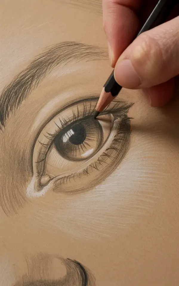
I get it. You bought a graphite pencil at the corner store, grabbed some random paper, and tried to copy a photo of a celebrity’s eye, only to end up with something that looks like a smudged football with lashes. The photo you are looking at right now is different though. It shows a hand, a pencil, and a textured beige surface that looks more like fabric than paper. And somehow, the eye in that image looks alive.
That specific look, the glossy highlight and the gritty grain, is achievable. And honestly? It is cheaper than you think. You do not need a €50 pencil set or a gallery-grade sketchbook. I wrote this guide for the budget-conscious sketcher who wants a realistic eye drawing in graphite without wasting money on fancy gear they will never use.
Why Paper Texture Matters for Realistic Eye Drawing
Here is the thing most tutorials never tell you: the paper is the real artist. The pencil is just the messenger. Look at the photo again. That beige paper is not smooth, it has visible fibers and a rough, toothy surface. When you drag a pencil across that, the graphite catches on the tiny hills and skips over the valleys. That is literally the secret to the grainy, detailed effect you see in the iris.
Tooth actually slows you down. It forces you to build up tone in layers rather than rubbing it in all at once, which is exactly what you want. If you draw on bristol board or printer paper, you get flat, shiny strokes. On textured watercolor paper (even the cheap stuff), you get texture that mimics the natural fibers of the eye itself.
Do not run out and buy the most expensive cotton rag paper yet. Grab a single sheet of cold-pressed watercolor paper, the 200gsm to 300gsm range. At an art supply store, they often sell these as loose sheets for less than two dollars. Perfect. That rough surface will do half of the shading work for you.
Affordable Graphite Pencils That Actually Perform
Ok so, the pencil range. You need three or four grades, not eighteen. A 2H for light structure, an HB for mid-tones, a 2B for the dark values, and a 4B or 6B for the pitch-black bits like the pupil and the lash line. That is it. That is the whole kit.
I am not gonna lie, branded pencils like Faber-Castell are nice, but the difference between those and a store brand is minimal once you learn pressure control. In fact, I have a weird preference for the cheap, hard sticks that come in a tin of twelve from the grocery store. They are grainy, they are inconsistent, but they produce a texture that feels organic. Use what you have.
One important detail for this specific photo: the pencil tip is fine. Notice how the artist is touching the surface, not stroking it? You want to keep a sharp point for the tiny lines in the iris. I sharpen with a normal sharpener, but I drag the tip on a piece of scrap paper to dull it slightly. That creates a soft, broken line that works well for the skin folds.
Breaking Down the Iris Without Overworking It
Let us get into the meat of the drawing. The iris is not a flat disc. It is a muscle with tiny, radiating fibers. To capture that, you need to work in short, directional strokes that start from the edge of the pupil and shoot outward, like bicycle spokes.
My technique for the photo’s style is to alternate two movements. First, I lay down a thin base of HB graphite with the flat side of the lead, just to tint the paper. Then, I switch to the 2B pencil with a sharp tip and draw individual, scratchy lines over that base. The combination of the soft base and the hard lines creates that realistic, fibrous depth.
Do not forget the shadows. The area under the upper eyelid is always darker because the lashes cast a shadow onto the eyeball. I push the 4B pencil here, blending slightly with my finger. However, you have to keep the lower part of the iris lighter, near the lower lid, because that area catches ambient light.
Layering and the Magic of the Highlight Spot
Look at the highlight in the photo. That small, white spot near the top of the eye is what makes the eye look wet and glossy. It is completely untouched paper. You have to plan for this before you even start shading.
Here is a practical pencil sketching trick: draw a tiny, sharp outline around the highlight area with your 2H pencil, just barely marking the boundary. Then go wild with your shading everywhere else. When you get to the end, you simply erase the faint 2H mark (or just leave it, it is usually too light to see) and the white paper shows through clean.
If you mess up and cover it with graphite, do not panic. A kneaded eraser is your best friend. Press it gently onto the spot to lift the graphite, kind of like a stamp. It will not look pristine white like the untouched paper, but it will be close enough for most viewers to not notice.
Drawing the Skin and Lashes with a Light Touch
The skin around the eye is not white. Especially on beige paper, it is a range of warm middle greys. I use the 2H and HB pencils here. The strokes need to be extremely light and short, almost like you are tickling the paper.
For the eyelid crease, do not draw a solid circle. Instead, use multiple short, broken lines that follow the curve of the bone. The eye in the photo has a subtle, almost tired fold on the upper lid. That is a sign of realism. We need to represent that with shading, not just a line.
The lashes are where most beginner drawings fall apart. They draw them as perfect, angled spikes. You want to draw them as soft, slightly overlapping strokes that fan out. The lower lashes are sparse and light. The upper ones are dense and dark. Draw the upper ones with your 4B, but let the pencil run out of resistance naturally so the tips are sharp and feathery.
My Best Tips for Avoiding the “Smudge Apocalypse”
You are going to rest your hand on the paper. It is inevitable. The grease and pressure will leave a mark. Here is a small, cheap trick: place a piece of scrap copy paper under your drawing hand. Slide it around as you work. It keeps the skin oils off the textured surface and stops the graphite from smearing.
Also, be mindful of the “graphite shine”. If you press too hard with a B-grade pencil, the graphite goes shiny and metallic. It looks terrible in photos and in person. To fix this, you have to use a spray fixative or transfer the drawing to a shadow box. But honestly, for an affordable practice piece, just let it be. The shine reduces if you leave the drawing alone for a day, oddly enough. It sort of settles into the paper fibers.
Why Your “Mistake” Might Actually Be Your Style
I hate perfectly smooth drawings. They look like prints, not art. This technique, with the rough paper and the broken strokes, is forgiving. If your line goes a little wobbly, it looks like a natural skin crease. If your shading is patchy, it looks like the texture of the iris.
So, here is your call to action: grab a pencil off your desk, find any textured envelope or piece of packaging, and draw a tiny eye. A small one, like a coin. Do not worry about the lashes or the eyelid. Just focus on the iris layers and that highlight spot. You will be surprised how the grain of the paper does the heavy lifting for you. Make a mess, smudge a few lines, and keep going. It is the best way to learn.
Leave a Comment